Notes/ experiments related to the material presented in the “Building Data Visualization Tools” module of the “Mastering Software Development in R” Specialization (Coursera) created by Johns Hopkins University.
Introduction
Visualization remains one of the most powerful ways to draw conclusions from data, visualize patterns present in the data. Visualization has an important role when performing EDA and when presenting findings/ conclusions in a report/ presentation/ pubblication.
The Data
Datasets used in the following examples are:
- Titanic dataset (
titanicpackage), information on the survival of passengers on the ‘Titanic’, with information to economic status (class), sex, age and survival (see?Titanicfor more information), - worldcup dataset (
farawaypackage), information about footbal players from the 2010 World Cup (see?worldcupfor more information) - nepali dataset (
farawaypackage), information collected from a public health study on Nepalese children (see?nepalifor more information)
How to install the packages…
install.packages("titanic") #for the Titanic dataset
install.packages("faraway") #for the worldcup/ nepali dataset
How to load the datasets…
require(titanic)
require(faraway)

data("titanic_train", package="titanic")
titanic <- titanic_train
data("worldcup")
data("nepali")
Plotting with ggplot2 package
The ggplot2 package allows to create useful & attractive graphics that can be used to explore and visualize the data withing different context, e.g. EDA and final reports/ data products. Useful graphics are mainly used when performing exploratory data analysis, while attractive graphics are used within the final data products. The dplyr package is used for manipulating the datasets.
How to install the packages…
install.packages("ggplot2", dependencies = TRUE)
install.packages("dplyr")
Remember to load the packages before actually using them…
require(dplyr)
require(ggplot2)
Basic Plotting: creating basic graphs
In order to create a basic plot using ggplot2
- create an object of the
ggplotclass- the canvas of the plot
- add on geoms and other elements to create and customize the plot (using a layering approach)
How to create the canvas…
The ggplot2::ggplot function is used to create an empty canvas, to construct the initial plot object and provide some initial settings for the plot/ graph. From the R Documentation
ggplot() initializes a ggplot object. It can be used to declare the input data frame for a graphic and to specify the set of plot aesthetics intended to be common throughout all subsequent layers unless specifically overridden.
The data argument is used to provide the default dataframe that will be used for the graph/ plot, while the mapping argument is used to provide the default list of aesthetic mappings to use for plot.
Aesthetics are properties of the plot linked to certain elements in the dataframe or a value (constant aesthetic). The aesthetics required for a plot depends on the type of geoms used for the plot, some aesthetics are mandatory others are optional. More information about aesthetics can be found in the R documentation for each geom (see ?geom_bar as example).
Common aesthetics are:
x, the position on the x-axisy, the position on the y-axisshape, shapecolor, the color of border of elementsfill, the color of inside of elementssize, size
The default settings of the canvas, data and mapping arguments, are moved done to the added layers/ geoms and, can be overwritten at the geom level.
# PSEUDO CODE
# Create the empty canvas
# No default data/ mapping have been provided
ggplot()

# Create the empty canvas
# With a default dataframe and dataframe/mapping
ggplot(data = dataframe)
ggplot(data = dataframe, mapping = aes(x = col_a, y = col_b))
How to create basic plots…
Example
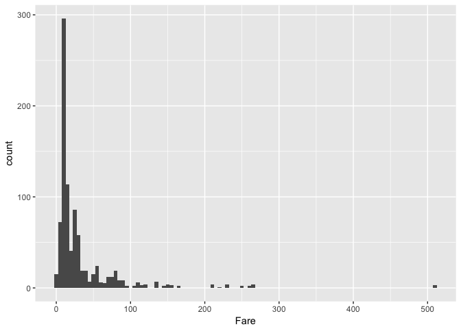
Visualize the distribution of Fare (Passenger Fare) in the titanic dataset__. The plot uses the geom_histogram()function to visualise the distribution of a single continuous variable by dividing the x-axis into bins and counting the number of observations in each bin.
#Mapping aesthetics x to the Fare column (default setting)
#The default setting is inherither by the geom_*** functions
#if not overridden
ggplot(data = titanic, mapping = aes(x = Fare)) +
    geom_histogram(binwidth = 5)
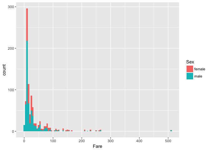
Adding the Sex dimension in the visualization using the fill aesthetic…
#Adding the fill aesthetic
ggplot(data = titanic, mapping = aes(x = Fare, fill = Sex)) +
    geom_histogram(binwidth = 5)
Example
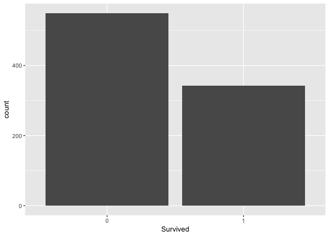
Visualize the distribution of Survived in the titanic dataset.
#Transforming into a factor
titanic$Survived <- as.factor(titanic$Survived)
ggplot(data = titanic, mapping = aes(x = Survived)) +
    geom_bar()
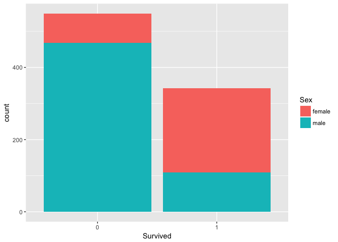
Adding the Sex dimension …
#Transforming into a factor
titanic$Sex <- as.factor(titanic$Sex)
ggplot(data = titanic, mapping = aes(x = Survived, fill = Sex)) +
    geom_bar()
Example
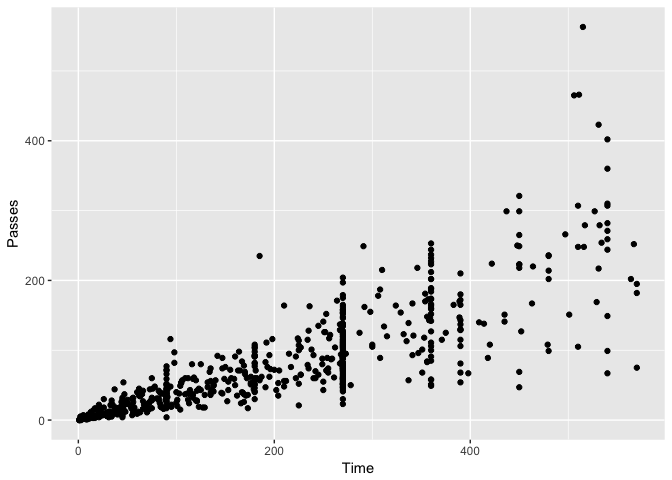
Visualize how many passes football players have done vs. the actual playing time in World Cup 2010. The plot uses the geom_point() function to create the scatterplot.
ggplot(data = worldcup, mapping = aes(x = Time, y = Passes)) +
    geom_point()
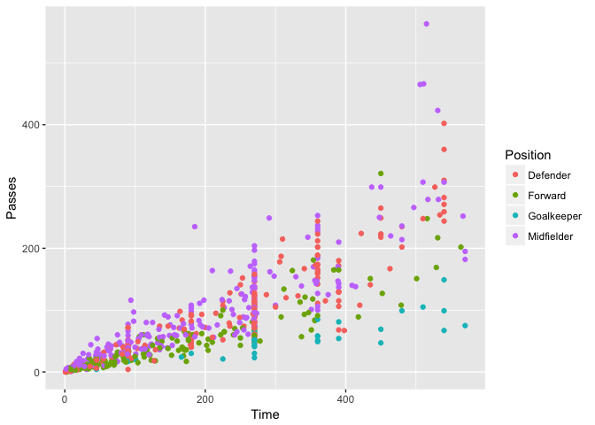
Using the color aesthetic is possible to add more information in the plot, for example the role/ position of each football player…
ggplot(data = worldcup, mapping = aes(x = Time, y = Passes, color = Position)) +
    geom_point()
How to create more sophisticated plots…
The creation of sophisticated plot is done using multiple geoms. Several geoms can be added on top of the same canvas, adding up new visual information layer by layer.
Each layer can use the default data and mapping settings, the ones provided in the ggplot(....), or it can overwrite such settings using a new dataset and different aesthetics.
Example
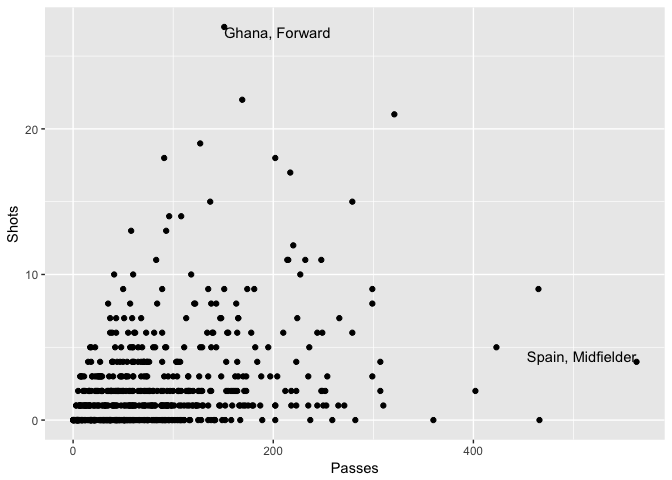
Visualize passes vs. shots football players have done during the Wordl Cup 2010, adding labels for noteworthy players.
#Identify the noteworthy players
#noteworthy player is a player having the max number of shots or passes done
#during the world cup. A new dataset is created with limited content
#specifically Shots and Passes (from the original dataset) and a new
#feature point_label (the text to be added to the plot)

#(filter) get the players where Shots == max(Shots) or Passes == max(Passes)
#add a new feature "point_label" with the relevant label

noteworthy_players <- worldcup %>%
    filter(Shots == max(Shots) | Passes == max(Passes)) %>%
    mutate(point_label = paste(Team, Position, sep =", "))

#Create the canvas using the worldcup dataset
#and mapping aesthetic x to Passes, and y to Shots
#(layer) create a scatterplot using the default aesthetics x and y
#(layer) (geom_text) add the labels using noteworthy_player as a new dataset
#       using the default aesthetic for x and y, setting aesthetic label to
#       point_label

ggplot(data = worldcup, mapping = aes(x = Passes, y = Shots)) +
    geom_point() +
    geom_text(data = noteworthy_players, mapping = aes(label = point_label), vjust = "inward", hjust = "inward")
When creating more sophisticated plots, there are also a number of elements, other than geoms, that can be added to a plot like:
ggtitle(), adding a plot titlexlab(),ylab(), add a lable on an axisxlim(),ylim(), limit the value range for an axis
Some Other Examples…
#Data preparation/ transformation
#select id, sex, weight, height and age
#transform id and sex into factor
#a child (identified by a unique ID) can have multiple observation
#keep only the first observation (and all of the other data)
data(nepali)
nepali <- nepali %>%
    select(id,sex,wt,ht,age) %>%
    mutate(id = factor(id),
           sex = factor(sex,
                        levels = c(1,2),
                        labels = c("Male", "Female"))) %>%
    distinct(id, .keep_all = TRUE)

head(nepali,2)
##       id    sex   wt    ht age
## 1 120011   Male 12.8  91.2  41
## 2 120012 Female 14.9 103.9  57
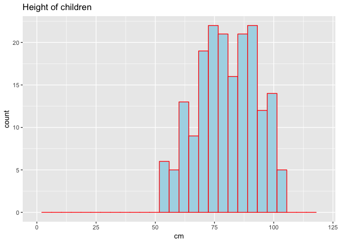
#Heigth distribution
ggplot(data = nepali, mapping = aes(x = ht)) +
    geom_histogram(fill = "lightblue", color = "red") +
    ggtitle("Height of children") +
    xlab("cm") + xlim(c(0,120))
## `stat_bin()` using `bins = 30`. Pick better value with `binwidth`.
## Warning: Removed 15 rows containing non-finite values (stat_bin).
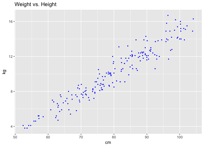
#Heigth vs. Weight plot
ggplot(data = nepali, mapping = aes(x = ht, y = wt)) +
    geom_point(color = "blue", size = 0.5) +
    ggtitle("Weight vs. Height") +
    xlab("cm") + ylab("kg")
## Warning: Removed 15 rows containing missing values (geom_point).
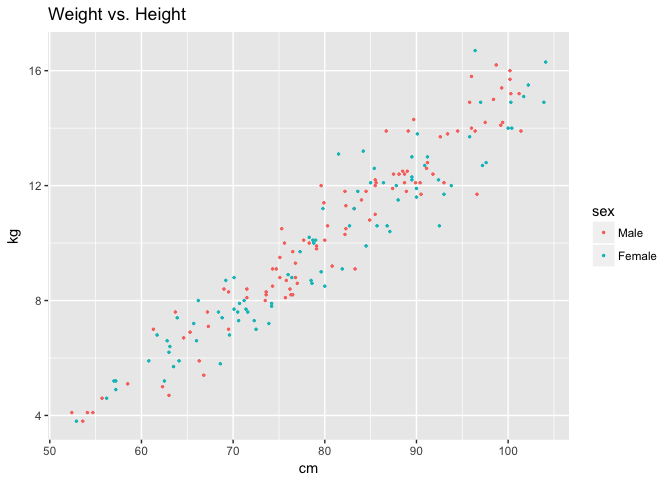
#Heigth vs. Weight plot adding the Sex dimension
ggplot(data = nepali, mapping = aes(x = ht, y = wt, color = sex)) +
    geom_point(size = 0.5) +
    ggtitle("Weight vs. Height") +
    xlab("cm") + ylab("kg")
## Warning: Removed 15 rows containing missing values (geom_point).
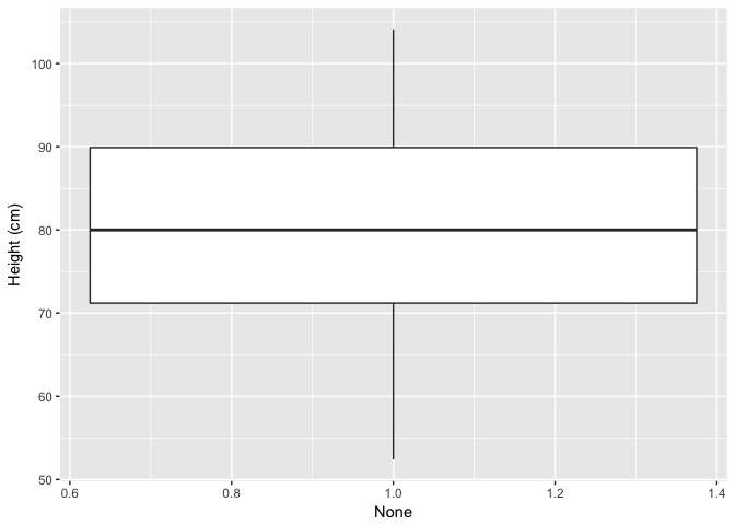
#Height Boxplot
#Note how x has been set to 1 in order to use all of the observations within
#the same boxplot
ggplot(data = nepali, mapping = aes(x = 1, y = ht)) +
    geom_boxplot() +
    xlab("None") + ylab("Height (cm)")
## Warning: Removed 15 rows containing non-finite values (stat_boxplot).
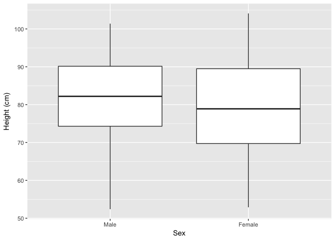
#Adding the sex dimension..
ggplot(data = nepali, mapping = aes(x = sex, y = ht)) +
    geom_boxplot() +
    xlab("Sex") + ylab("Height (cm)")
## Warning: Removed 15 rows containing non-finite values (stat_boxplot).
ggplot2 extensions
There are some packages that extend the ggplot2 package and allow to create interesting plots. An example the GGally package and the ggpairs() function for the creation of a matrix of plots based on the given dataset.
#How to install the package
#install.packages("GGally")
library(GGally)
ggpairs(nepali %>% select(sex, wt, ht, age))
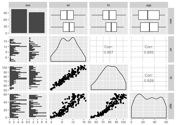
More examples can be found at http://www.ggplot2-exts.org/.
References
- Chapter 4, “Mastering Software Development in R” book by Roger D. Peng, Sean Kross, and Brooke Anderson