The content of this blog is based on notes/ experiments related to the material presented in the “Building Data Visualization Tools” module of the “Mastering Software Development in R” Specialization (Coursera) created by Johns Hopkins University [1] and “chapter 5: The Grammar of Graphics: The ggplot2 Package” of [2].
‘ggplot2’ package, essential concepts
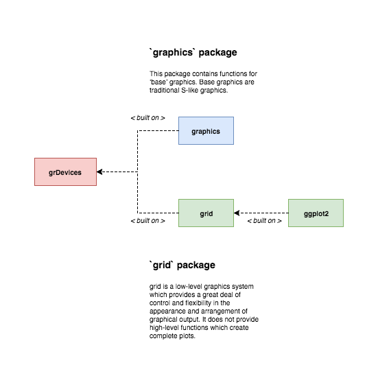
The ggplot2 package is described as “a system for ‘declaratively’ creating graphics based on ‘The Grammar of Grapics’” CRAN. It represents a complete graphic system completely separated, and uncompatible, from the traditional graphic package in R. Actually the ggplot2 is built on the grid package and provides high level functions to generate complete plots within the grid world.
The ggplot2package is not part of the standard R installation so it must be first installed and then loaded into R…
#Install
install.packages("ggplot2")
#Load
library(ggplot2)
The ggplot2 Graphics Model
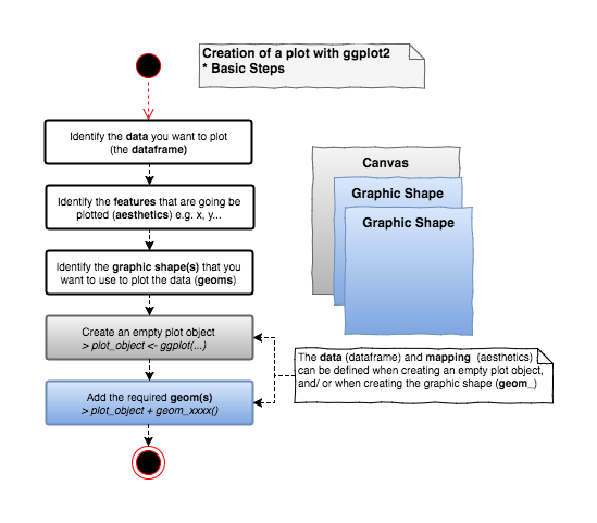
The ggplot2package provides a set of components that can be used to create simple graphic components, like lego blocks, that can be combined to create complete and complex plots.
The essential steps to create a plot are:
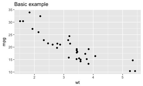
An example of a basic plot…
# Using the mtcars dataset in the 'datasets' package
# Data was extracted from 1974 Motor Trend US magazine,
# includes fuel consumption and 10 aspects of automobile design
# and performance for 32 automobiles (1973–74 models).
#?mtcars #use for more information

# Suppose that we want to visualize how the consuption changes
# based on the weight -> Plotting the Miles/ per gallon
# vs. weight

# when creating the plot object information about the data and
# mappings (aesthetic) is provided. These setting will be the
# default settings for the other components (geom_) added to the
# plot
plot_object <- ggplot(data = mtcars, mapping = aes(y = mpg, x = wt)) + ggtitle("Basic example")
# geom_point does not need to specify the data and mapping because
# it has already specified at the plot object level (note they can
# be overwritten at the geom_ level)
plot_object + geom_point()
Some essential concepts to master when working with ggplot2 are
- geoms & aesthetics,
- scales,
- statistical transformations,
- coordinate transformations.
- the
groupaesthetic, - position adjustments,
- facets,
- themes.
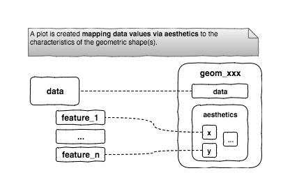
Geoms and aesthetics
Geoms help to specify what sort of graph (type of graph) will be used in the plot, while aesthetics help to add some more low level details about the graph.
Specifically, each geom has a set of required and optional aesthetics that are used to control the specific parts of the graph. Required aesthetics must be provided or an exception is going to be thrown when creating the plot. For each specific geom more information can be found in the R documentation (see ?geom_xxxx). Geoms and aesthetics provides the basis for creating a wide variety of plots with ggplot2.
For example, if we want to create a scatterplot the geom_point geom must be used. From the R documentation this geom understands the following aesthetics:
- x, y (mandatory), define what is going to be actually plotted on the x- y- axis,
- alpha, colour, fill, group, shape, size, stroke (optional).
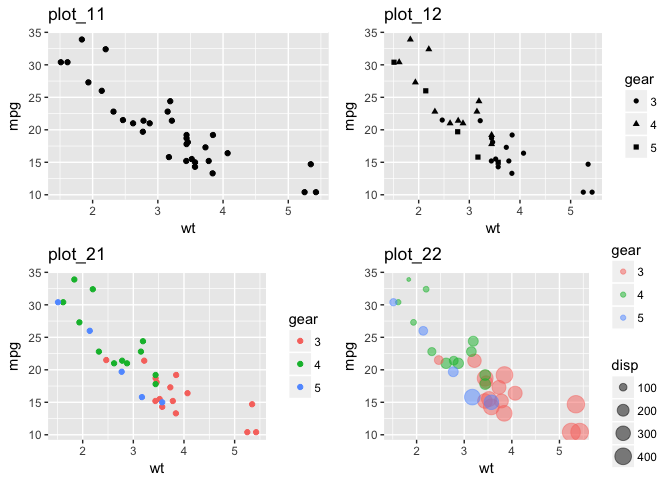
Using the aesthetics we are able to define & customize the plot adding more and more information to it (see example below).
#shape needs to be mapped to a categorical value
#gear is categorical by nature
mtcars$gear <- factor(mtcars$gear)

plot_object <- ggplot(data = mtcars, mapping = aes(y = mpg, x = wt))
plot_11 <- plot_object + geom_point() + ggtitle("plot_11")
plot_12 <- plot_object + geom_point(aes(shape = gear)) + ggtitle("plot_12")
plot_21 <- plot_object + geom_point(aes(colour = gear)) + ggtitle("plot_21")
plot_22 <- plot_object + geom_point(aes(colour = gear, size = disp), alpha = 0.5) + ggtitle("plot_22")

gridExtra::grid.arrange(plot_11, plot_12, plot_21, plot_22, ncol = 2)
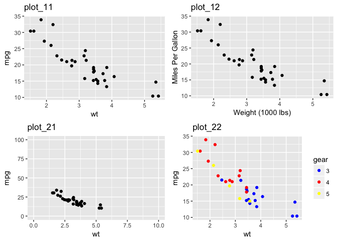
Scales
Another important component in ggplot2 is the scale component. The scale component allows to customize the axis and legends information on plots. Scales are normally automatically managed by ggplot2 but sometimes more control is needed in order to optimize our plot. ggplot2 provides a number of different scale functions that can be used for this purpose, those functions follow the following naming-pattern
# Pseudo-code
scale_[aesthetic]_[vector type]

# Some examples in ggplot2
# scale_x_continuous, scale_x_date, scale_x_datetime, scale_x_discrete
# scale_shape_continuous, scale_shape_discrete
...
plot_object <- ggplot(data = mtcars, mapping = aes(y = mpg, x = wt))
plot_11 <- plot_object + geom_point() + ggtitle("plot_11")

# scale_x_ and scale_y_ can be used to change the title
plot_12 <- plot_object + geom_point() +
  scale_x_continuous(name = "Weight (1000 lbs)") +
  scale_y_continuous(name = "Miles Per Gallon") + ggtitle("plot_12")

# scale_x_ and scale_y_ can also be used to control the range of the axis
plot_21 <- plot_object + geom_point() +
  scale_x_continuous(limits = c(0,10)) +
  scale_y_continuous(limits = c(0,100)) + ggtitle("plot_21")

# scale_color_manual can be used to control "manually" your own color sets
plot_22 <- plot_object + geom_point(aes(colour = gear)) +
  scale_color_manual(values = c("blue", "red", "yellow")) + ggtitle("plot_22")

gridExtra::grid.arrange(plot_11, plot_12, plot_21, plot_22, ncol = 2)
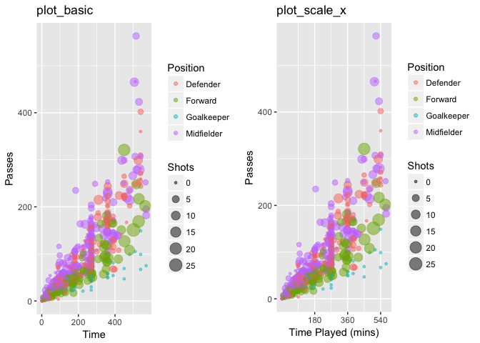
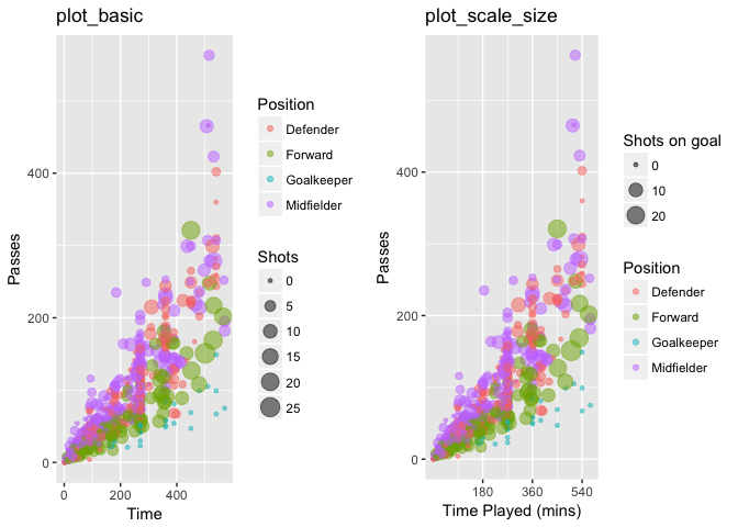
Some more examples …
plot_object <- ggplot(data = worldcup, mapping = aes(x = Time, y = Passes, color = Position, size = Shots))
plot_basic <- plot_object + geom_point(alpha = 0.5) + ggtitle("plot_basic")

# using the scale_ functions to change some x-axis settings
# the title
# and breaks
plot_scale_x <- plot_basic +
  scale_x_continuous(name = "Time Played (mins)",
                     breaks = 90 * c(2,4,6),
                     minor_breaks = 90 * c(1,3,5)) + ggtitle("plot_scale_x")

gridExtra::grid.arrange(plot_basic, plot_scale_x, ncol = 2)
# Customizing the size aesthetic, specifically
# the title
# the breaks used
plot_scale_size <- plot_scale_x +
  scale_size_continuous(name = "Shots on goal",
                        breaks = c(0,10,20,30)) + ggtitle("plot_scale_size")

gridExtra::grid.arrange(plot_basic, plot_scale_size, ncol = 2)
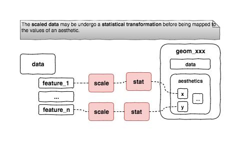
Statistical Transformations
Every geom has a stat associated to it (default setting) and every stat has a geom associated to it (see ?geom_xxxx). A stat defines a transformation to be used on the data before being mapped to aesthetics.
Some examples
- the
geom_pointhas thestat = "identity"associated to it (default setting),- the
stat_identityis a special transformation that leaves the data unchanged, the data values are mapped directly to the aesthetics (without any actual transformation)
- the
- the
geom_barhas thestat = "count"associated to it (default setting),- the
stat_countis a transformation that counts the number of cases at each x position
- the
- the
geom_smoothhas thestat = 'smooth'associated to it (default setting),- the
stat_smoothis a transformation that iads to see patterns in the plot.
- the
plot_object <- ggplot(data = mtcars)
# example using the geom_point (and the stat_identity)
plot_11 <- plot_object + geom_point(mapping = aes(y = mpg, x = wt)) + ggtitle("plot_11")
# example using the geom_bar (and the stat_count)
plot_12 <- plot_object +
geom_bar(mapping = aes(x = factor(am))) + ggtitle("plot_12")
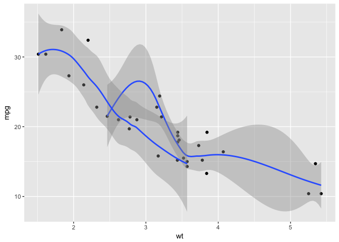
# example using the geom_smooth (and the stat_smooth)
plot_21 <- plot_object + geom_smooth(mapping = aes(y = mpg, x = wt)) + ggtitle("plot_21")
# example using explicitly the stat_smooth (and the geom_smooth)
plot_22 <- plot_object + stat_smooth(mapping = aes(y = mpg, x = wt)) + ggtitle("plot_22")
gridExtra::grid.arrange(plot_11, plot_12, plot_21, plot_22, ncol = 2)
![]()
It is also possible to use explicitly the stat component instead of the geom, this works because stat components automatically have a geom associated with them. The advantage of using directly the stat component is that parameters of the stat can be specified clearly as part of the stat (not possible when using the geom).
plot_object <- ggplot(data = mtcars)
# example using explicitly the stat_smooth (and the geom_smooth)
plot_11 <- plot_object + stat_smooth(mapping = aes(y = mpg, x = wt)) + ggtitle("plot_11")

# example using explicitly the stat_smooth (and the geom_smooth)
# setting explicitly the method we want to use
plot_12 <- plot_object + stat_smooth(mapping = aes(y = mpg, x = wt), method = "lm") + ggtitle("plot_12")

gridExtra::grid.arrange(plot_11, plot_12, ncol = 2)
![]()
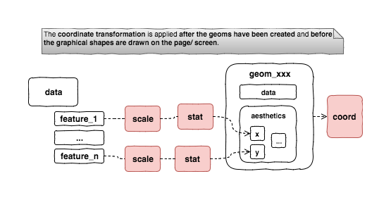
Coordinate Transformations
Another type of transformation available in ggplot2 is thhe coordinate transformation. There is a coordinate system component, by default set to a simple linear cartesian coordinates, that could be explicitly set to something else. The peculiarity of this type of transformation is that it does occur after the geoms have been created and control how the graphs (geoms) are drawn on the screen.
plot_object <- ggplot(data = mtcars)

#Apply a log scale both on x and y
#logged data with linear axes
plot_11 <- plot_object + geom_point(mapping = aes(y = mpg, x = wt)) +
  scale_x_continuous(trans = "log") +
  scale_y_continuous(trans = "log") +
  geom_line(mapping = aes(y = mpg, x = wt), stat = "smooth", method = "lm") +
  ggtitle("log data with linear axes")

#Apply an "exp" coordinate transformation to x & y
#before actually plotting the graphs/ geoms
#logged data with exponential axes
plot_12 <- plot_11 +
  coord_trans(x = "exp", y = "exp") + ggtitle("log data with exponential axes")

gridExtra::grid.arrange(plot_11, plot_12, ncol = 2)
![]()
The group aesthetic
ggplot2 automatically handles plotting of multiple groups of data using the shape, color, … aesthetics. Sometimes it would be useful to be able to explicitly force a grouping for a plot. This can be achieved via the group aesthetic.
plot_object <- ggplot(data = mtcars, mapping = aes(y = mpg, x = wt))
plot_object + geom_point() +
  geom_smooth(mapping = aes(group = am))
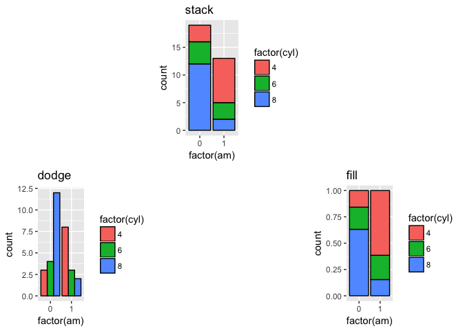
Position Adjustment
ggplot2 often handles automatically how to arrage overlapping geoms. The position adjustment can be controlled using the position argument for the geom (see example below).
plot_object <- ggplot(data = mtcars, mapping = aes(x = factor(am), fill = factor(cyl)))
plot_1 <- plot_object + geom_bar(color = "black") + ggtitle("stack") #default position is stack
plot_2 <- plot_object + geom_bar(color = "black", position = "dodge") + ggtitle("dodge")
plot_3 <- plot_object + geom_bar(color = "black", position = "fill") + ggtitle("fill")
grid.arrange(plot_1, plot_2, plot_3, ncol = 3, layout_matrix = rbind(c(NA,1,NA), c(2,NA,3)))
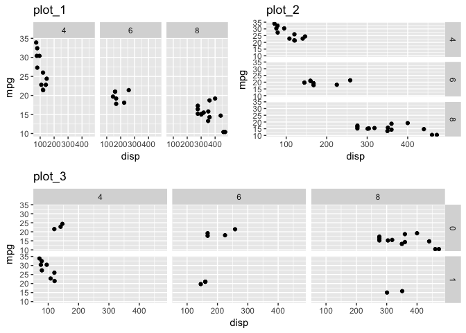
Facets
Facets/ faceting means to break the data into several subsets and create a separate plot for each subset (also known as small multiples). ggplot2 provides two different functions fro creating small multiples: the facet_grid() and the facet_wrap() functions.
facet_grid forms a matrix of panels defined by row and column facetting variables, in other words the fact_grid can facet by one or (max) two variables.
#Pseudo code
facet_grid(facets = [factor for rows] ~ [factor for columns],....)
plot_base  <- ggplot(data = mtcars, mapping = aes(x = disp, y = mpg)) + geom_point()
plot_1 <- plot_base + facet_grid(. ~ cyl) + ggtitle("plot_1") #only feature for columns
plot_2 <- plot_base + facet_grid(cyl ~ .) + ggtitle("plot_2") #only feature for rows
plot_3 <- plot_base + facet_grid(am ~ cyl) + ggtitle("plot_3") #both feature for rows & columns
grid.arrange(plot_1, plot_2, plot_3, ncol = 4, layout_matrix = rbind(c(1,1,2,2), c(3,3,3,3)))
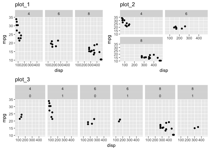
facet_wrap can facet by one or more variables and it wraps a 1-dimensiona sequence of panels into 2 dimension.
#Pseudo code
facet_wrap(facets = ~[formula with factor(s) for faceting], ncol = [number of columns],....)
plot_base  <- ggplot(data = mtcars, mapping = aes(x = disp, y = mpg)) + geom_point()
#faceting by one variable
plot_1 <- plot_base + facet_wrap(~ cyl) + ggtitle("plot_1")
#faceting by one variable controlling the no fo columns
plot_2 <- plot_base + facet_wrap(~ cyl, ncol = 2) + ggtitle("plot_2")
#faceting by multi variables
plot_3 <- plot_base + facet_grid(~ cyl + am) + ggtitle("plot_3")
grid.arrange(plot_1, plot_2, plot_3, ncol = 4, layout_matrix = rbind(c(1,1,2,2), c(3,3,3,3)))
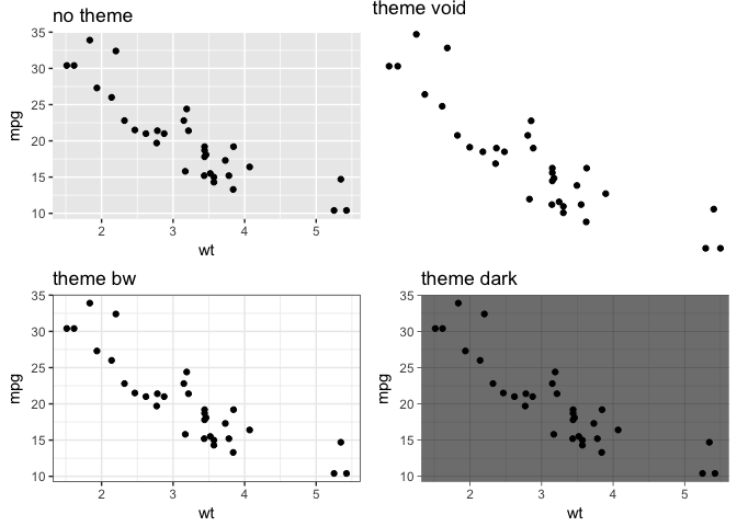
Themes
In ggplot2 there is a distinction between data related and non-data related elements. Specifically, geoms are data related elements while labels, lines used to create axes and legends, etc are non-data related elements.
The collection of graphical parameters that control non-data related elements is called a theme. A theme can be added as another component to a plot to change the appearance of graphical objects. A number of theme functions are provided in ggplot2 like theme_bw(), theme_minimal(), theme_dark(), theme_classic(), etc (see ?theme_bw for more information) and more can be found in other packages like ggthemes.
A theme controls all non-data display in a plot, a theme is useful when standardization is necessary when plotting for all plots in the same report, publication, company, etc.
plot_object <- ggplot(data = mtcars) + geom_point(mapping = aes(y = mpg, x = wt))
# example using the geom_point (and the stat_identity)
plot_theme_no <- plot_object + ggtitle("no theme")
plot_theme_void <- plot_object + ggtitle("theme void") + theme_void()
plot_theme_bw <- plot_object + ggtitle("theme bw") + theme_bw()
plot_theme_dark <- plot_object + ggtitle("theme dark") + theme_dark()

grid.arrange(plot_theme_no, plot_theme_void, plot_theme_bw, plot_theme_dark, ncol = 2)
References
[1] “Mastering Software Development in R” by Roger D. Peng, Sean Cross and Brooke Anderson, 2017
[2] “R Graphics, Second Edition” by Paul Murrell, (2011) CRC Press
[3] “Building Data Visualization Tools (Part 1): basic plotting with R and ggplot2” by Pier Lorenzo Paracchini