The content of this blog is based on examples/ notes/ experiments related to the material presented in the “Building Data Visualization Tools” module of the “Mastering Software Development in R” Specialization (Coursera) created by Johns Hopkins University [1].
Setting up
Packages used for running the examples…
# If necessary to install a package run
# install.packages("packageName")

# Load packages
library(ggplot2)
library(dplyr) # supporting data manipulation
library(gridExtra) # adding extra features for plotting
library(ggthemes) # extra themes (based on ggplot2)
Data used for the examples…
# install.packages("dlnm")
library(dlnm)
# Data used for this example in chicagoNMMAPS
# Daily Mortality Weather and Pollution Data for Chicago (dataset)
# ?chicagoNMMAPS #for more info about the data
data("chicagoNMMAPS") #?chicagoNMMAPS
chic <- chicagoNMMAPS
# selecting only data for July 1995
chic_july <- chic %>%
  filter(month == 7 & year == 1995)

# install.packages("faraway")
library(faraway)
data("worldcup")
# Data on players from the 2010 WOrld Cup
# ?worldcup #for more info about the data
Data Visualization
The main objective of a visualization is to tell a story with data, to tell an interesting and engaging story. Plots/ graphs can help to visualize what the data have to say.
Data is a representation of real life, data is the manifestation of specific behaviors/ events. There are stories and meanings behind the data. Sometimes those stories are simple and straighforward, other times they are complex and difficult to understand.
Data can be used to tell amazing stories, plots/graphics are one of the means that can be used to tell these stories or part of them. See examples below
- Examples of NASA graphics
- Examples of New York Times graphics
- Data sings, a great example “New Insights on poverty” by Hans Rosling, TED
When exploring the data, there are two main things to look for: patterns and relationships. These are the things that good graphics/ plots tries to capture. And remember to question always what you see, ask “Does it make sense?”. Data checking and verification is one of the most important task when looking for stories in the data.
Simple guidelines
Six simple guidelines that can be used to create good graphics/ plots (based on the works of Edward Tufte, Howard Wainer, Stephen Few, Nathan Yau) are:
- 1# Aim for high data density.
- 2# Use clear and meaningful labels.
- 3# Provide useful references.
- 4# Highlight interesting aspect of the data.
- 5# Use small multiples.
- 6# Make order meaningful.
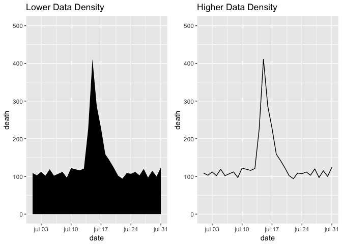
1# Aim for high data density
Try to increase, as much as possible, the data to ink ratio in your graph, the ratio of “ink” providing information to all ink used in the figure. Increasing the data to ink ratio makes it easier for users to see the message in the data, see example below.
base_plot <- ggplot(data = chic_july, mapping = aes(x = date, y = death)) +
  scale_y_continuous(limits = c(0, 500))

# Lower Data Density
plot_1 <- base_plot +
  geom_area(fill = "black") + ggtitle("Lower Data Density")

# Higher Data Density
plot_2 <- base_plot +
  geom_line() + ggtitle("Higher Data Density")

grid.arrange(plot_1, plot_2, ncol = 2)
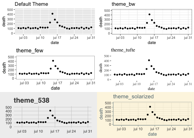
Themes can be used to manipulate the data density in a graphic/ plot, selecting the correct theme can help increasing the data-to-ink ratio, see examples below.
plot_1 <- base_plot +
  geom_point() + ggtitle("Default Theme")

plot_2 <- base_plot +
  geom_point() + ggtitle("theme_bw") + theme_bw()

plot_3 <- base_plot +
  geom_point() + ggtitle("theme_few") + theme_few()

plot_4 <- base_plot +
  geom_point() + ggtitle("theme_tufte") + theme_tufte()

plot_5 <- base_plot +
  geom_point() + ggtitle("theme_538") + theme_fivethirtyeight()

plot_6 <- base_plot +
  geom_point() + ggtitle("theme_solarized") + theme_solarized()

grid.arrange(plot_1, plot_2, plot_3, plot_4, plot_5, plot_6, ncol = 2)
2# Use clear and meaningful labels
The default behavior of ggplot2 is to use the column names as labels for the x- and y-axis. This behavior is acceptable when performing EDA, but it is not adequate for graphics/ plots used within reports, presentations, papers. Labels should be clear and meaningful.
Strategies that can be used to make labels clearer and meaningful:
- use
xlab,ylabfunctions to customize your labels (alternatively e.g.scale_x_continuous). - Include units of measures and scales in your labels when relevant.
- Change the values of categorical data to meaningful values.
3# Provide useful references
Data is easier to interpret when you add references.
base_plot <- ggplot(data = chic_july, mapping = aes(x = date, y = death))

# Lower Data Density
plot_1 <- base_plot +
  geom_line() + theme_bw() + ggtitle("No Reference")

# Higher Data Density
plot_2 <- base_plot +
  geom_hline(yintercept = 120, color = "gray") +
  geom_hline(yintercept = 90, color = "gray")  +
  geom_line() + theme_bw() +
  ggtitle("Reference")

grid.arrange(plot_1, plot_2, ncol = 2)
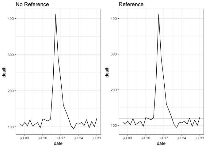
Strategies to add references to a graphic/ plot:
- Add a linear or smooth fit to the data using
geom_smoothfunction. - Using lines and polygons to add references
geom_hlineandgeom_vline,to add horizontal or vertical linesgeom_abline, to add a line with an intercept and slopegeom_polygon, to add a filled polygongeom_path, to add an unfilled polygon.
- Add the reference elements first, so teh data will be plotted on top of it.
- Use
alphato add transparency to the reference elements. - Use colors that are not attracting attention.
4# Highlight interesting aspects
Considering adding elements to highlight specific aspects of the data.
base_plot <- ggplot(data = chic_july, mapping = aes(x = date, y = death))
# Let's make the hypothesis that a heat wave was present in theg the period 14.07 - 17.07

# No Highlight of this interesting aspect
plot_1 <- base_plot +
  geom_line() + theme_bw() + ggtitle("No Highlight")

# With Highlight of this interesting aspect
plot_2 <- base_plot +
  geom_segment(aes(x = as.Date("1995-07-14"), xend = as.Date("1995-07-17"),
                   y = max(chic_july$death) + 10, yend = max(chic_july$death) + 10), color = "red", size = 3) +
  geom_line() + theme_bw() +
  ggtitle("With Highlight of Heat Wave period")

grid.arrange(plot_1, plot_2, ncol = 2)
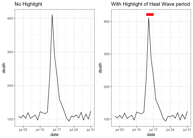
Geoms like geom_segment, geom_line, geom_text are quite useful for highliting interesting aspects in the graph.
5# Use small multiples (when possible)
Small multiples are graphs that use many small plots to show different subsets of the data. All plots use the same x- and y- ranges making it easier to compare across plots.
facet_grid and facet_wrap functions can be used to create in a simple way small multiples for the data (see facets section in [3]). Often, when using faceting, it is necessary to rename or re-oder the factor levels of categorical features in order to make the graphs easier to read and interpret.
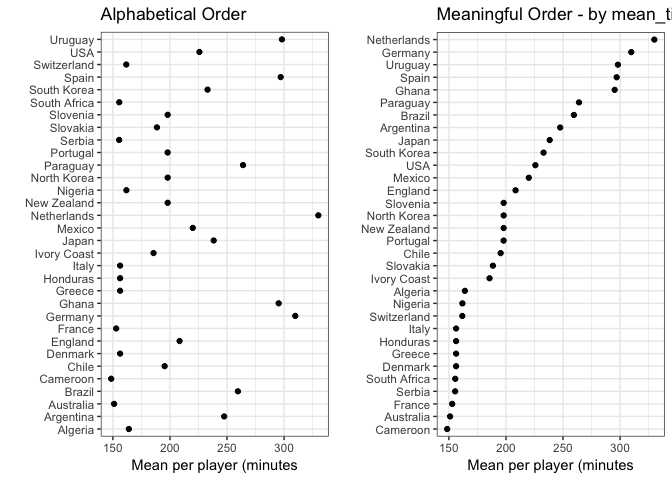
6# Make order meaningful
Adding order to plots can help highlight interesting finding/ aspects in the data. When working with categorical features (factor) often the default ordering (e.g. alphabetical order) is not interesting and it needs to be changes to something more meaningful, see example below.
worldcup_data <- worldcup %>%
  group_by(Team) %>%
  summarise(mean_time = mean(Time))

# Default ordering of the Team (categorical)
plot_1 <- ggplot(data = worldcup_data, mapping = aes(x = mean_time, y = Team)) +
  geom_point() +
  theme_bw() +
  xlab("Mean per player (minutes") +
  ylab("") +
  ggtitle("Alphabetical Order")

# With a more meaningful order - by mean_time
plot_2 <- worldcup_data %>%
  arrange(mean_time) %>%
  #reorganize the level in Team (factor) before plotting
  mutate(Team = factor(Team, levels = Team)) %>%
  ggplot(mapping = aes(x = mean_time, y = Team)) +
  geom_point() +
  theme_bw() +
  xlab("Mean per player (minutes") +
  ylab("") +
  ggtitle("Meaningful Order - by mean_time")

grid.arrange(plot_1, plot_2, ncol = 2)
Some more considerations
- If using encodings in a plot/ graph, (explicitly) explain encodings used in the visualization - What does these circles, bars and colors represent? What does that symbol represent?
- When plotting numeric values, add required information to the labels - Is it logarithmic, exponential,…?
- keep the plot in check - e.g. Does elements in a pie chart sum up to 100%?
- Include your sources, give the data some context - Where does your data come from?
- Consider your audience and the purpose of the plot/ graphic
References
[1] “Mastering Software Development in R” by Roger D. Peng, Sean Cross and Brooke Anderson, 2017
[2] “Building Data Visualization Tools (Part 1): basic plotting with R and ggplot2” by Pier Lorenzo Paracchini
[3] “Building Data Visualization Tools (Part 2): ‘ggplot2’, essential concepts” by Pier Lorenzo Paracchini